1: Unveiling a New Season with a Fresh Look
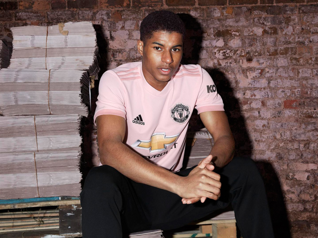
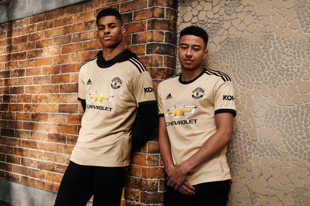
With the return of the football season comes an exhilarating wave of anticipation, novelty, and passionate enthusiasm. It is a fascinating time for the zealous supporters of Manchester United. The illustrious club has removed the curtain on their arresting away kit for the 08-09 season. This new ensemble astutely brings together the threads of tradition and contemporary aesthetics. It serves as a tribute to the club’s storied history while embodying a forward-thinking design philosophy.
2: A Reverberating Palette: A Symbiosis of Past and Future
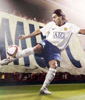
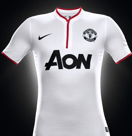
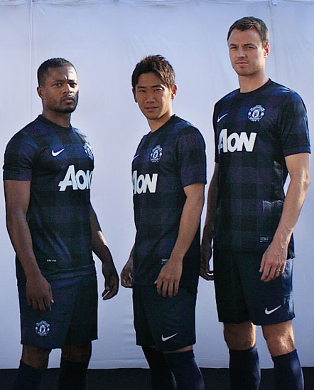
The new kit is a testament to clever design and color play. It combines an artful blend of white, blue, and a touch of red. This palette has been selected carefully to balance modern-day fashion sensibilities and Manchester United’s deep-rooted heritage. The shirt, in a pristine white hue, provides a stark contrast to the dark blue shorts. This design choice serves a functional purpose, making the players stand out vividly on any field they adorn. To round off the outfit, the kit includes white socks, a nod to the timeless elegance of many traditional football kits.
3: Crafting Identity through Details
Diving into the nuances of the design, a unique red inverted triangle graces the front collar of the shirt. This detail might be small, but it carries significant weight. It gives the kit an instantly recognizable element, making it a standout to fans across the globe. The red triangle embodies Manchester United’s symbolic color, subtly hinting at the club’s storied past and enduring tenacity.
The shirt also sports two blue vertical stripes running along the sides. These stripes work in tandem with the blue shorts, reinforcing the visual appeal of the ensemble. They create a harmonious and uniform look that permeates the entire kit.
4: A Nod to Sponsorship: The AIG Logo Reimagined
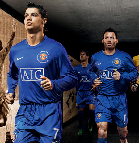
In the spirit of design coherence and boldness, Manchester United has made a remarkable decision regarding its sponsor’s logo. Usually presented in its traditional color scheme, the AIG logo has been altered to a bold blue hue for this season’s away kit. This change maintains design consistency while subtly reinforcing the audacity theme that the kit represents.
5: A Nostalgic Tribute: Continuing with the Home Kit
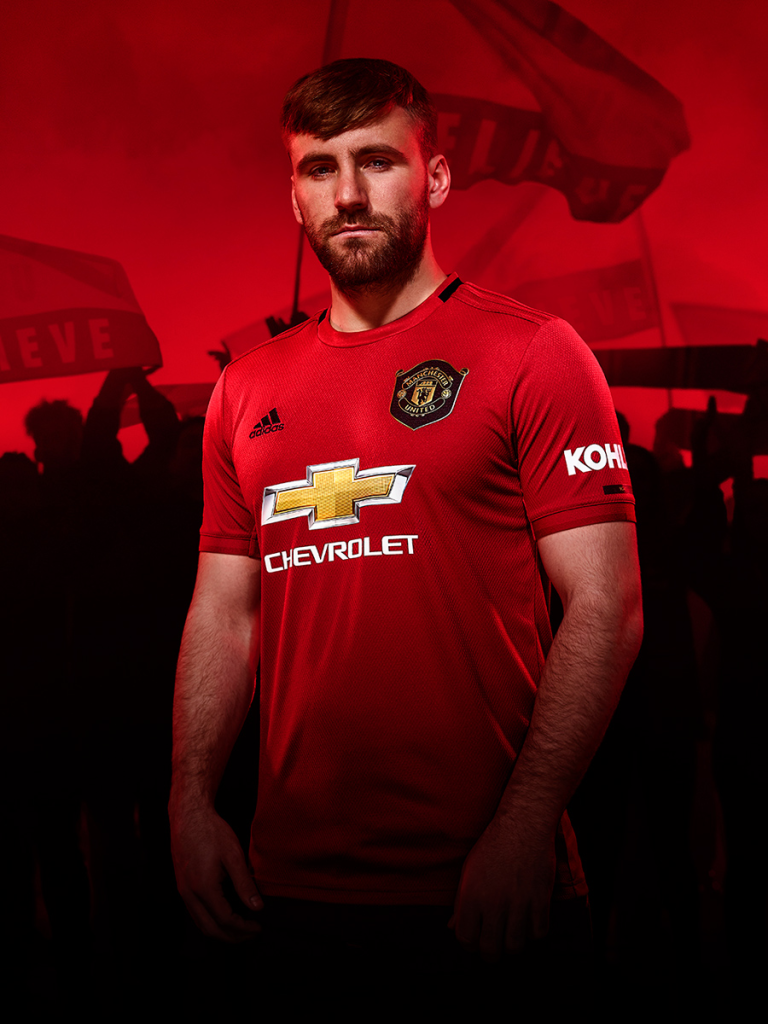
Die-hard fans anticipating a new home kit must extend their patience a bit longer. Manchester United has decided to extend the reign of their previous season’s home kit into the new season. This kit, fondly named the “champion’s kit,” debuted successfully. It bore witness to a fortunate run for the team and is believed to have brought good luck. With such a good association, the club management has decided to postpone unveiling a new home kit until the end of the season.
6: Reflecting on the Fusion: A Harmonious Blend of Yesterday and Tomorrow
The new away kit for Manchester United’s 08-09 season is a dynamic fusion of innovation and tradition. It carries forth the club’s spirit while introducing a fresh, stylish perspective. It will be intriguing to see the fans’ reactions and, more importantly, to watch the team’s performance in this unique attire. With the “champion’s kit” still retained for home games, the upcoming season is set to be an exciting and memorable chapter in Manchester United’s illustrious legacy.
7: The Visual Aesthetics: Celebrating Unity in Design
The visual aesthetics of the new away kit play a key role in bringing the entire design together. Each element, from the contrasting colors, the red inverted triangle, to the blue stripes along the flanks of the shirt, contributes to a uniform look that represents Manchester United’s unity.
The white shirt and dark blue shorts enhance the players’ physical appearance on the field. It’s an aesthetic not merely chosen for its elegance but also for its strategy in the area – making the team members stand out yet uniting them into a formidable force.
8: The Innovative Logo Re-coloration: Honoring AIG
In this sea of blue and white, Manchester United has decided to deviate from tradition by altering the color of the AIG logo on the new away kit. This shift in the color scheme shows a club ready to move ahead with time while keeping its roots intact. The reimagined AIG logo aligns with the overall color palette and imparts a cohesive appearance that reflects Manchester United’s values of dynamism and evolution.
9: The Familiar Home Kit: An Emblem of Good Fortune
The decision to continue with the previous season’s home kit signifies more than just a fondness for the design. The “champion’s kit,” as it has been named, is associated with a successful season that saw Manchester United achieve great strides. It is an emblem of good fortune and positive vibes that the team would like to carry into the new season. This nostalgic continuation keeps the energy from the successful past season alive, generating excitement and anticipation for future games.
10: A Final Reflection: The Seamless Integration of Old and New
Manchester United’s new away kit for the 08-09 season is more than just a uniform; it reflects the club’s ethos, a perfect blend of honoring tradition while welcoming innovation. It captures the spirit of unity, courage, and dynamism, attributes Manchester United has demonstrated throughout its history. As fans, we can’t wait to see the team donning this new attire that perfectly balances the old and the new. With the old “champion’s kit” on the home ground and the further away kit, the upcoming season will surely be another exciting chapter in Manchester United’s distinguished legacy.

 Bundesliga


 Campeonato Brasileiro Serie A


 Chilean Primera Division


 Dutch Eredivisie


 EFL Championship


 J1 League


 La Liga


 Liga MX


 Liga Profesional


 Ligue 1


 MLS
MLS


 Premier League
 Primeira Liga


 Saudi Professional League


 Scottish Premiership


 Serie A


 Brasileiro Serie A Training Suit


 Bundesliga Training Suit
 Dutch Eredivisie Training Suit
 La Liga Training Suit
 Liga MX Training Suit
 Liga Portugal Training Suit
 Ligue 1 Training Suit
 MLS Training Suit
 Premier League Training Suit


 Saudi Professional League Training Suit

 Serie A Training Suit


